Mid - Fidelity Prototype
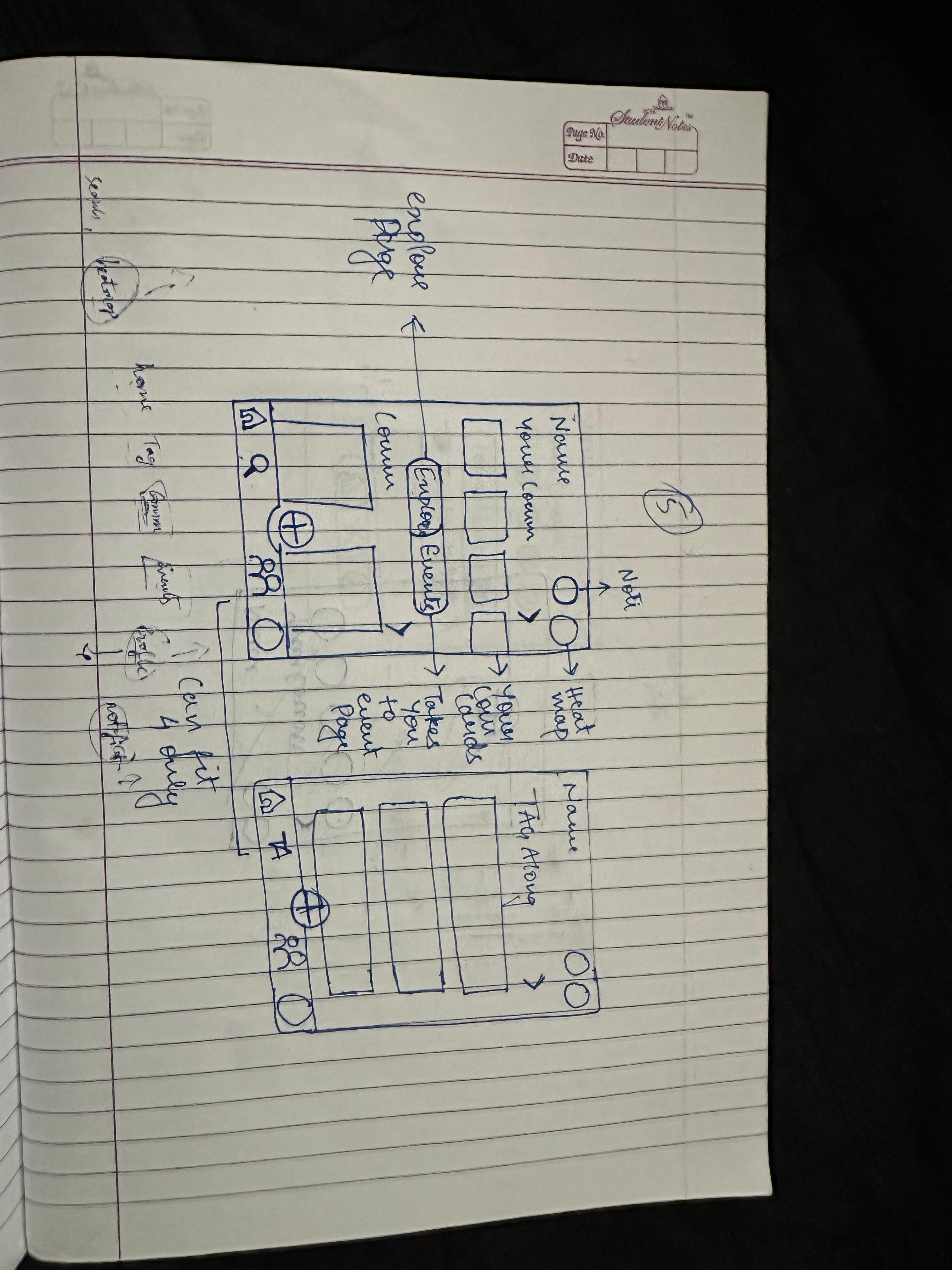
Using Figma, we translated our first sketches into mid-fidelity wireframes. We started by laying out all the screens we needed to design. We blocked out sections for each element and did our detailed work.
Sketches
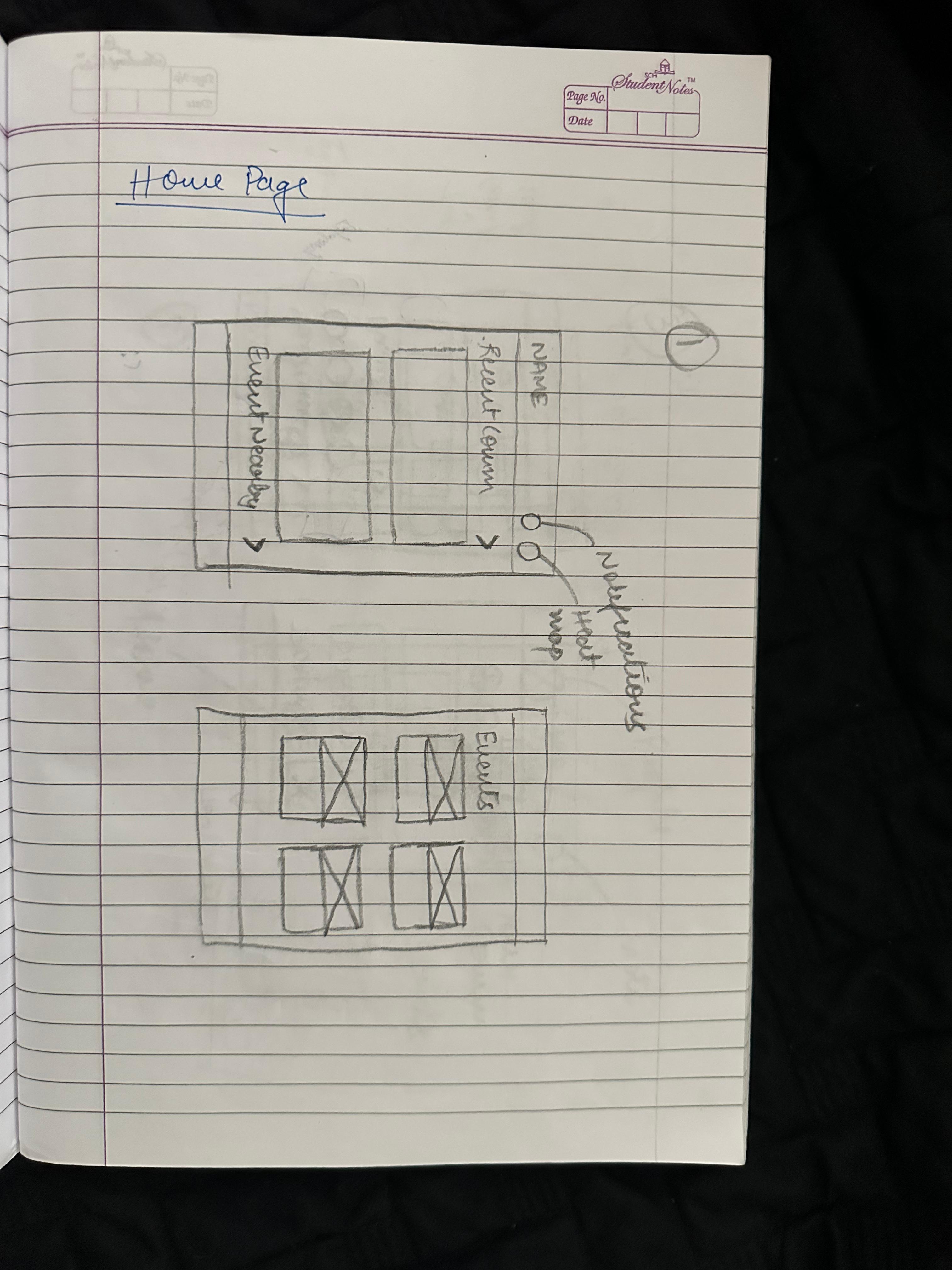
This was the moment where ideas started to take shape. We dove into the design phase with quick, low-fidelity sketches that allowed us to explore possibilities without overthinking. Inspired by what we heard in user interviews and guided by both business goals and usability principles, these early sketches gave form to student needs and pain points, setting the stage for a simple, friendly interface.

Design Kit
This design kit is more than a collection of visuals; it’s a foundation for meaningful experiences. Every element buttons, menus, icons, colors, and typography was intentionally crafted by us to feel clear, consistent, and approachable. It serves as a guide that not only streamlines collaboration but also ensures that every interaction feels natural, intuitive, and respectful of the user’s journey.
Color
Primary
Used Across all the interactions and components
#405DE6
#833AB4
Gradient
Neutrals
Used Across all the interactions and components
#000000
#FFFFFF
SF Pro

Heading 1
Heading 2
Heading 3
Heading 1Extrabold
Heading 1Extrabold
Heading 1Extrabold
Paragraph 1
There are many variations of passages o Lorem Ipsum available, but the majorit have suffered alteration in some form.
Paragraph 2
There are many variations of passages o Lorem Ipsum available, but the majorit have suffered alteration in some form.
Description
Schedule it for
to
More
More
Type the vibe name
write the description of your activity
dd - mm - yyyy
__ : __
__ : __
Input Fields
Logo

Icons


Navigation Bar


Uni-Verse
UX Research · AI Learning Systems · Human-AI Interaction
The solution introduces an in-context AI assistant that overlays real-time, step-by-step guidance within complex tools, reducing context switching and cognitive load while improving learning retention, task clarity, and user confidence through interactive, visual support.

Homie.AI
AI + Data Systems · Context-Aware Personalization · Explainable AI (XAI)
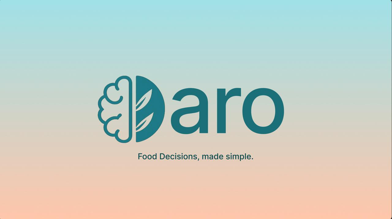
The solution introduces a personalized food decision engine that combines a knowledge graph with deterministic safety logic to evaluate products in real time, reducing decision friction while improving transparency, trust, and dietary alignment through explainable, user-specific insights.
Aro.AI
UX Design · CX Research · Human-AI Interaction
In a hematology triage environment strained by fragmented systems and high referral volumes, the Smart Hematology Triage System unifies patient context into a single AI-assisted workspace, cutting information-gathering time by ~40% to support faster, safer decisions.
Smart Triage Mayo Clinic
Product Design · Behavioral Design · Engagement Systems
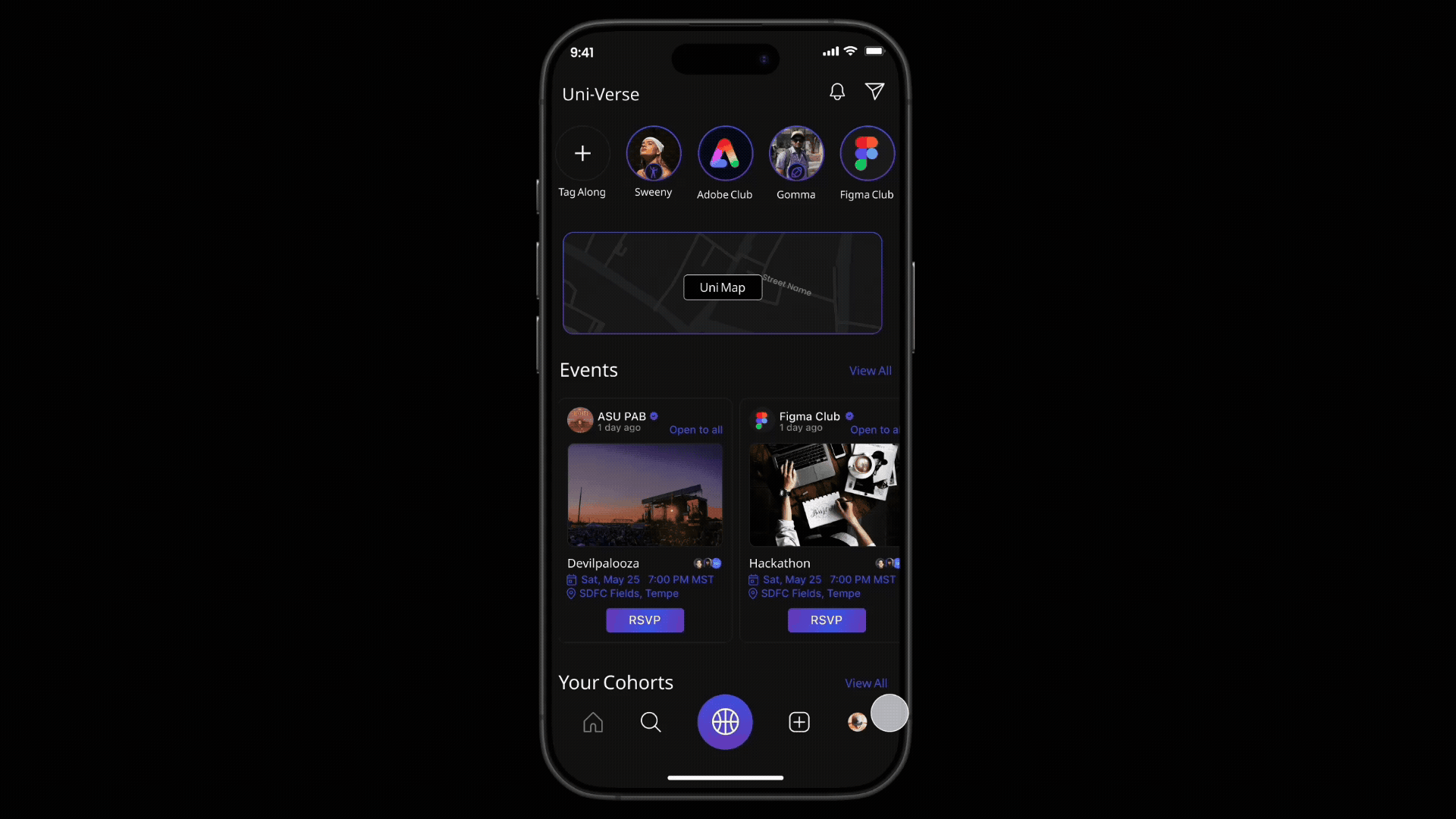
A real-time campus engagement platform that enables spontaneous activity matching, event discovery, and live shuttle tracking to help students connect, participate, and feel a stronger sense of belonging on campus.
Uni-Verse
Product Design · AI Workflow Design · Agent Experience
AILO is a personal AI platform that lets users create and manage multiple domain-specific agents with memory, logic, and proactive behavior, bringing tasks, reminders, and insights into one unified system instead of scattered tools.
AILO - AI
Usability testing · Accessibility · Task Flows
Conducted a usability evaluation of the Cornish Pasty Co. website, uncovering key issues in menu discovery and ordering flow. Design changes improved task completion by ~35%, reduced ordering errors, and improved merchandise visibility, resulting in a clearer, lower-friction experience.
Cornish Pasty Co.
UX Research · Behavioral mapping · Micro-Interaction
Real-time, collaborative photo syncing inside Google Photos, eliminating manual uploads and reminders. By sharing photos in the moment, the feature addresses a documented 30-50% post-event photo sharing drop-off caused by delay, friction, and social hesitation.
LiveSync-
Google Photos
Motion-Based UX · Gamification · Wearable Integration
Reimagining meditation by integrating guided breathing with everyday physical activities, enabling mindfulness through movement. The experience aligns breath, rhythm, and sensory feedback to make mindfulness more accessible, engaging, and sustainable for dynamic lifestyles.
Active-Zen


The Problem
University students, especially freshmen and internationals—struggle to connect, adapt, and stay engaged on campus, often leading to loneliness and missed opportunities.
The Goal
Design a digital companion for students that reduces isolation, connects communities, and makes participating in campus life simple and welcoming.
The Solution


Uni-Verse


A campus social platfrom with spontaneous activity matching, event discovery, community groups and live events and shuttle tracking
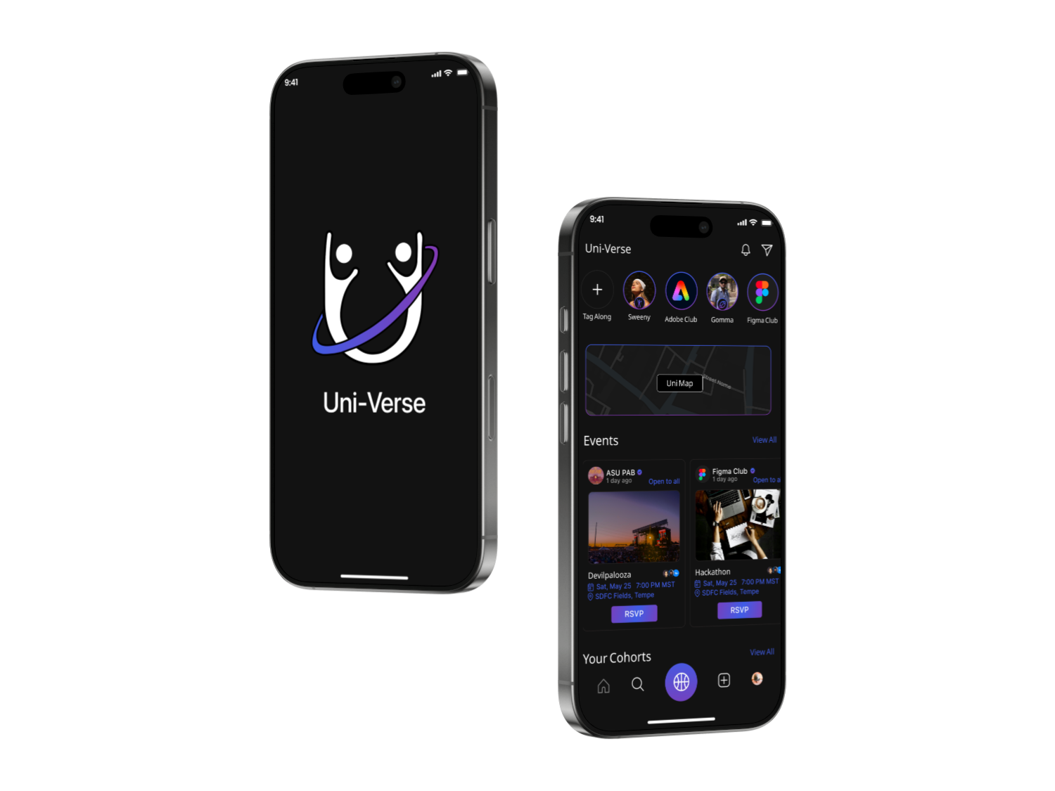
Don’t just go—tag along.
Together feels better.


Street Name
Street Name
Street Name
Street Name
Street Name
Street Name
Street Name
Street Name
Street Name
Street Name
Street Name
Street Name

I’ve got what’s happening around you.
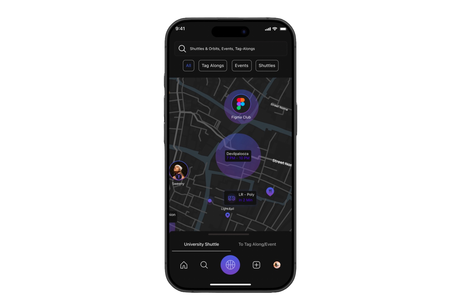
Social Heat map
Our Design Process
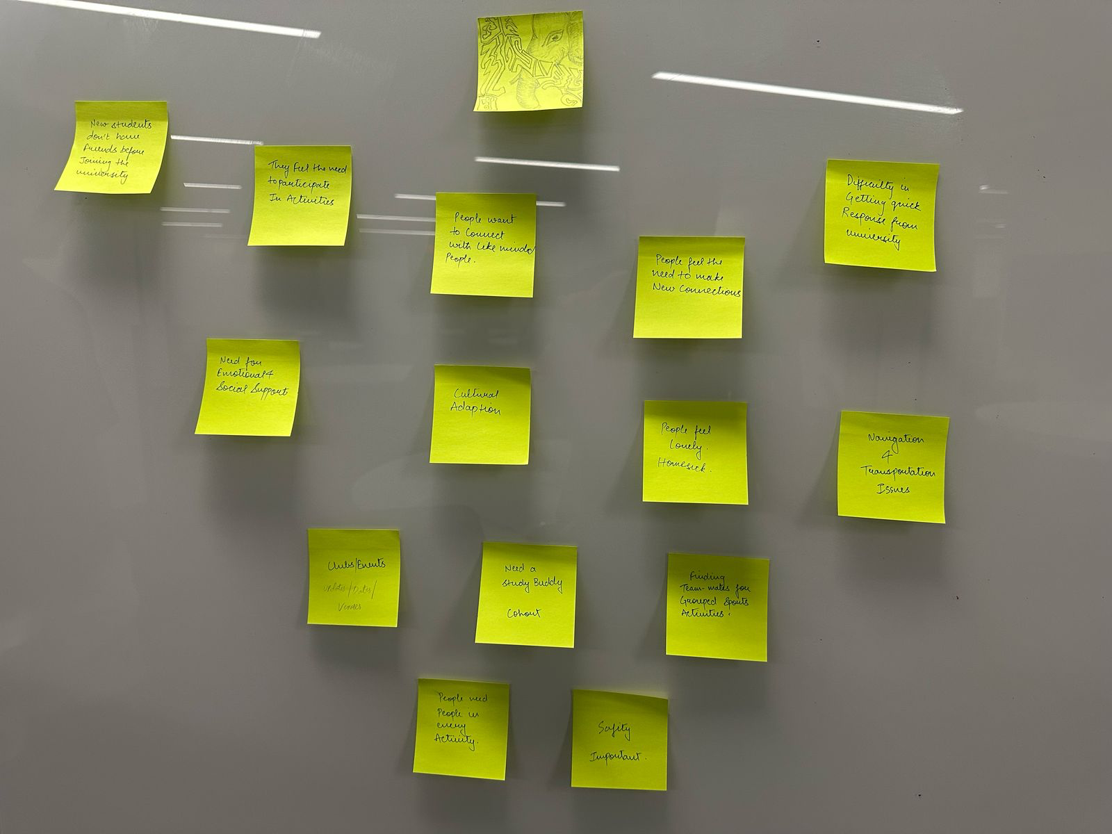
Empathize
During this phase, we validated the problems we had observed such as loneliness, hesitation to attend events alone, and transportation issues while also discovering new challenges students face, like feeling ignored in groups, struggling with cultural adjustment, and missing opportunities due to poor event visibility.
User Survey Insights
To validate assumptions and uncover real needs, we conducted a survey with 58 students. The results revealed that many hesitate to attend events alone, cancel plans without company, and struggle to find like-minded peers for activities such as studying, sports, or hobbies. Students also highlighted frustration with missed shuttles and poor visibility of campus events, confirming the need for a solution that combines social connection with logistical support.
Define
At this stage of the process, We created personas, empathy mapping, and visualized customer journeys.
Empathy Mapping
User Journey Mapping
To validate assumptions and uncover real needs, we conducted a survey with 58 students. The results revealed that many hesitate to attend events alone, cancel plans without company, and struggle to find like-minded peers for activities such as studying, sports, or hobbies. Students also highlighted frustration with missed shuttles and poor visibility of campus events, confirming the need for a solution that combines social connection with logistical support.
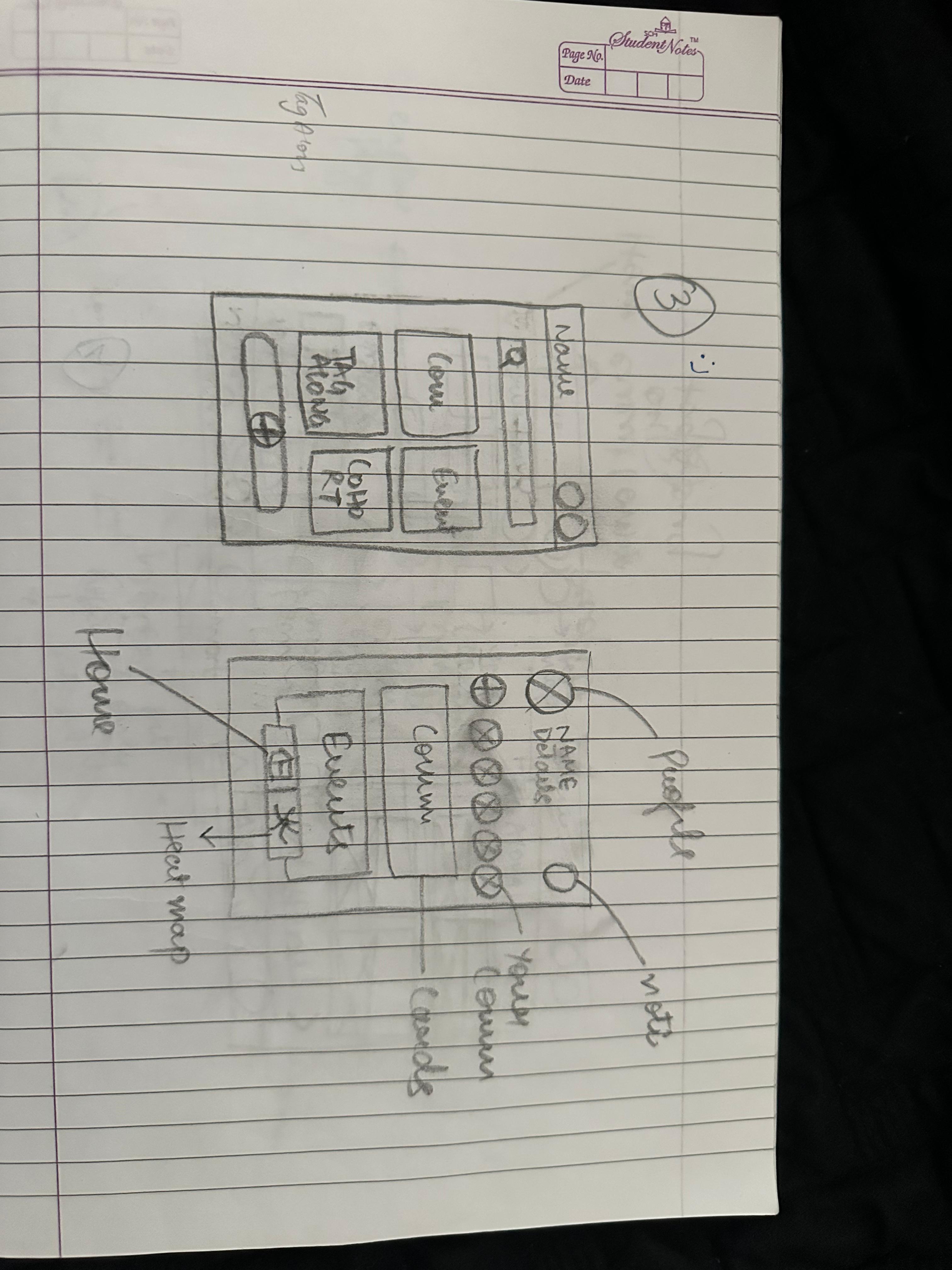
Ideate
We established the information architecture to ensure seamless navigation across all core features and defined the brand guidelines that shaped a consistent, intuitive, and visually cohesive user interface.
Information Architecture
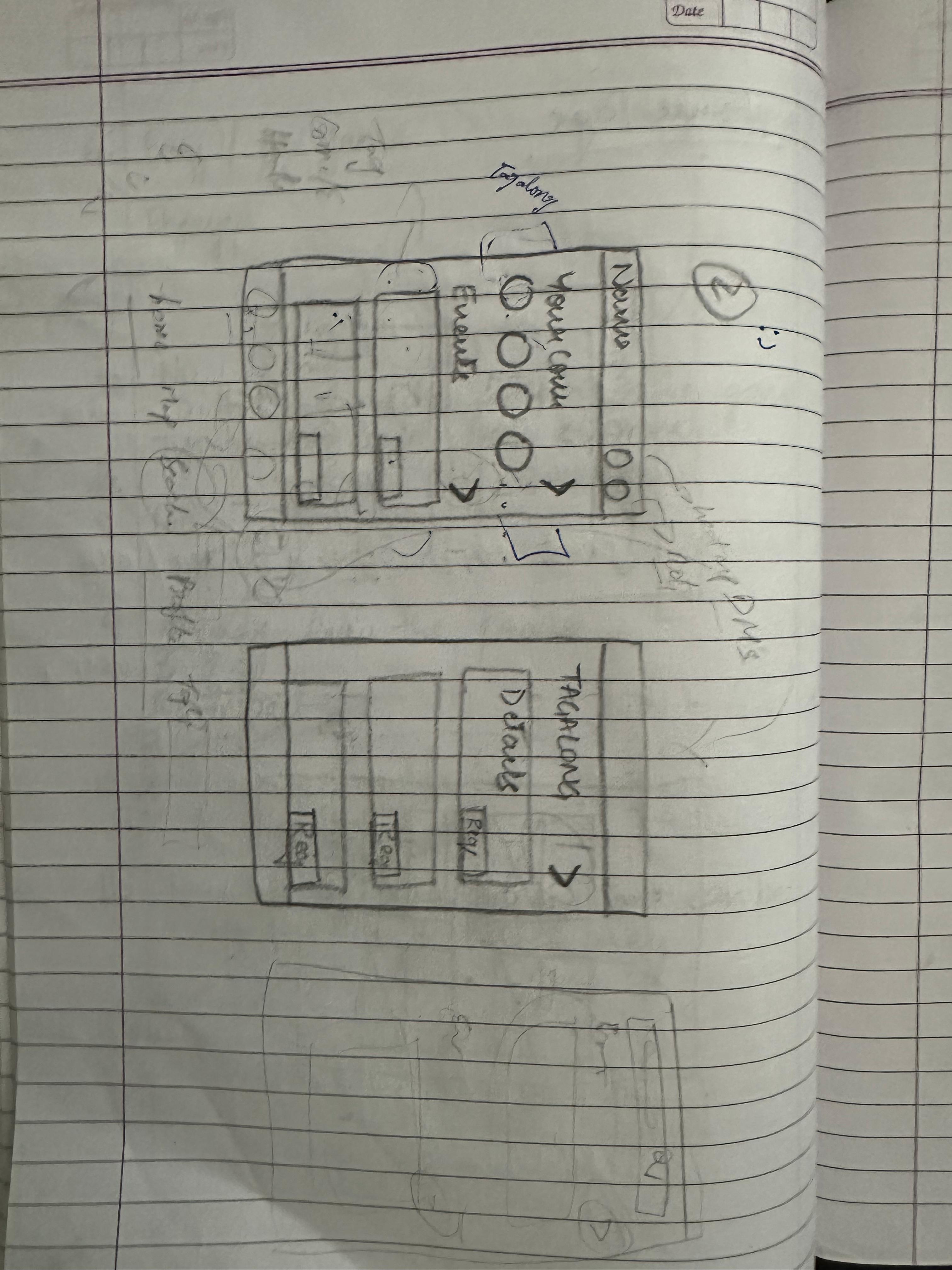
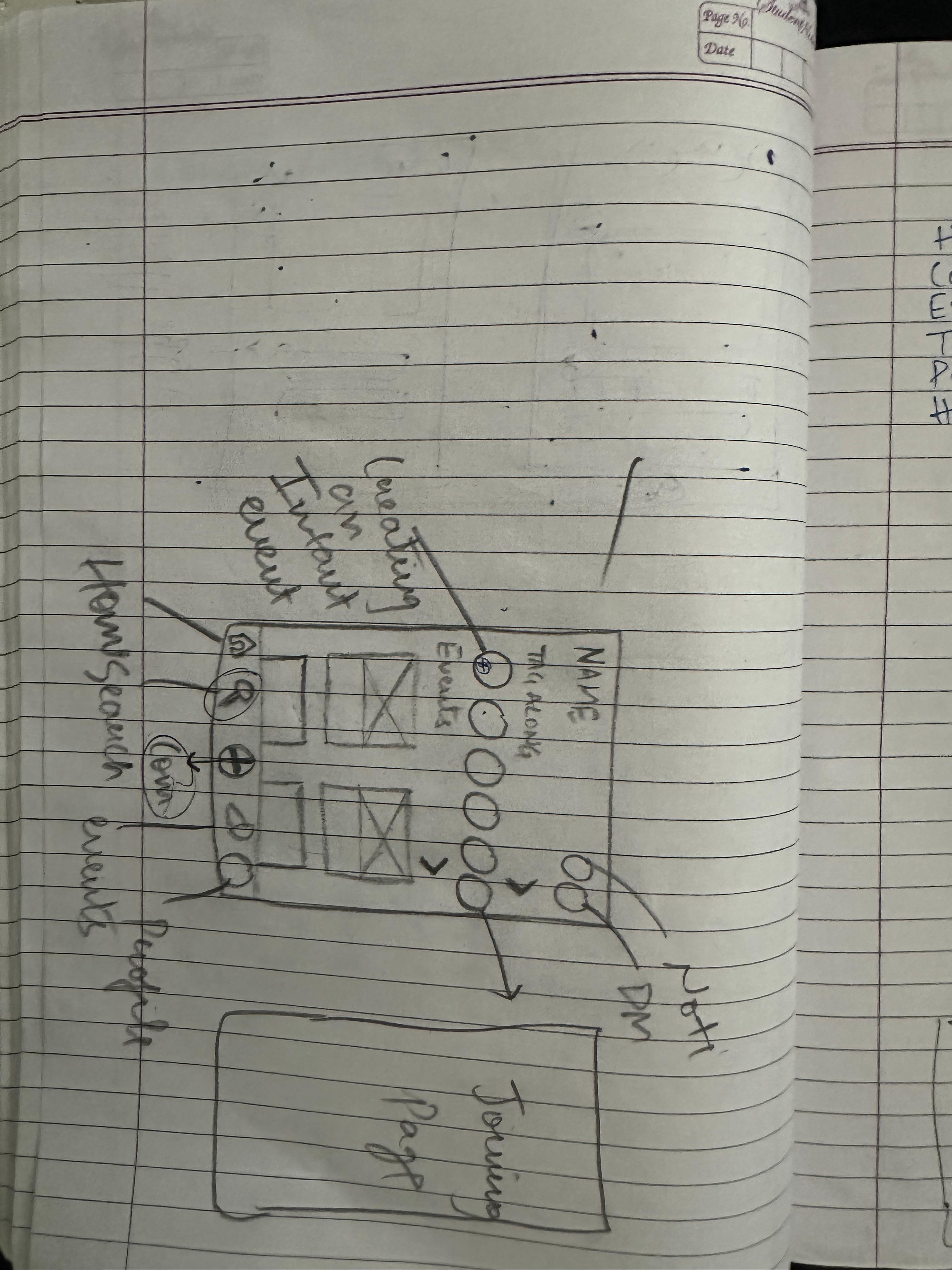
The platform’s information architecture is designed for clarity and ease of use, structured around core sections such as Tag-Along, Communities, Events, and the Social Heat Map. Each section addresses specific student needs for example, we designed Tag-Along to enable students to join activities without going alone, while we built the Social Heat Map to provide real-time event visibility and shuttle tracking to reduce uncertainty.
Competitive Analysis
Feature Analysis
Introduction
A social platform where students connect, belong, and thrive on campus.
Bringing campus life closer, Uni-Verse is a real-time engagement app designed to help students connect, participate, and thrive. From finding events to navigating communities, Uni-Verse turns everyday campus experiences into opportunities for friendship, discovery, and growth.
- Real-time social heat map for campus activities.
- Tag-Along to join friends at events.
- Communities for interest-based connections.
- Shuttle tracking & live updates for easy navigation.
- Student-first platform vision with clear design principles.
405DE6
High- Fidelity Prototype
This is where the product truly came to life. I designed 30 high-fidelity screens, making sure the look and feel stayed consistent across the app. Every detail from navigation to animations was crafted to make the experience smooth, engaging, and easy for students to use.
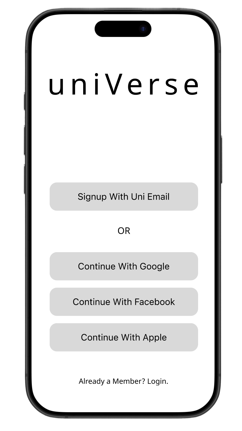
Login
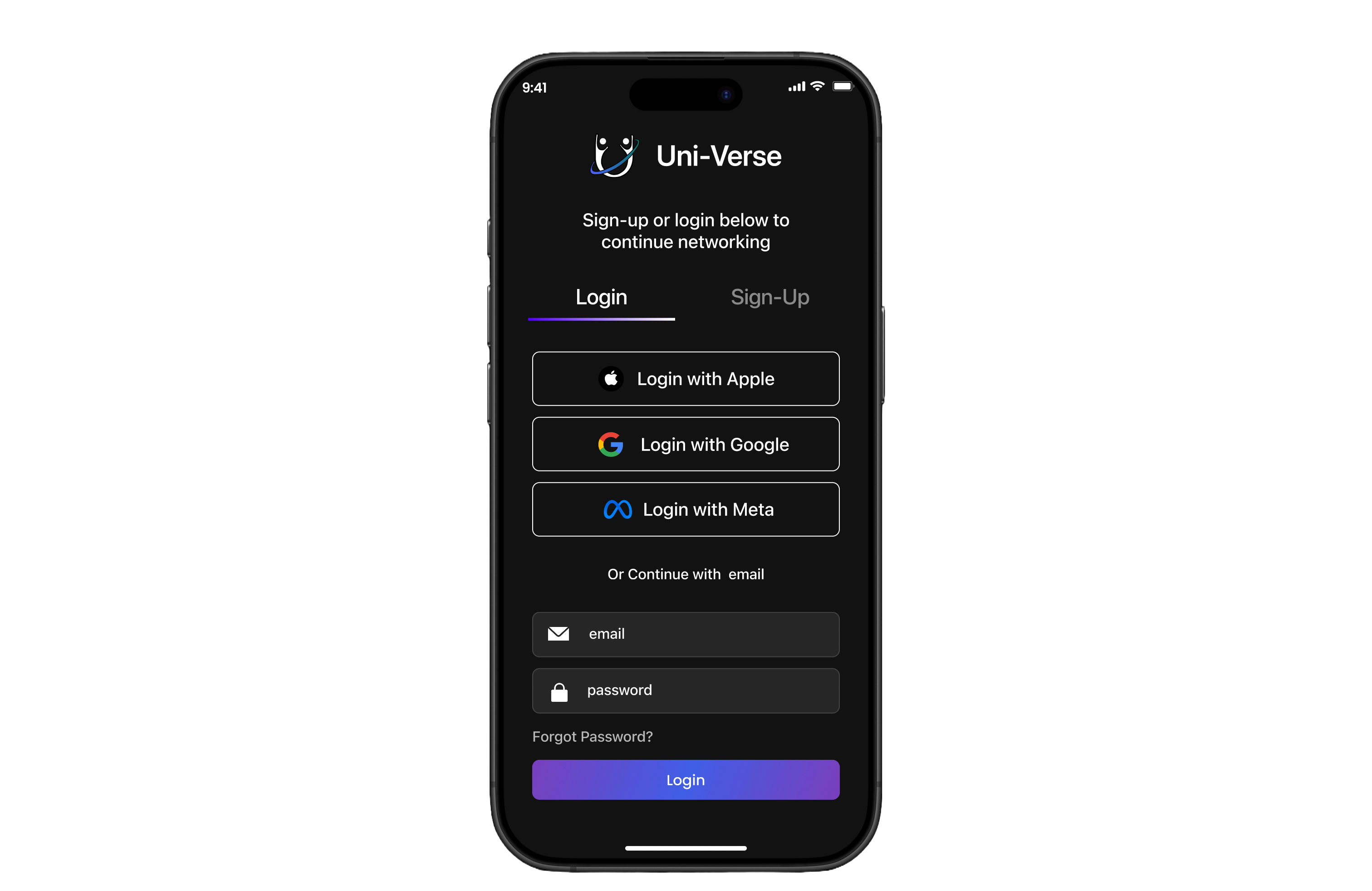

Multiple sign-in options – Apple, Google, Meta for quick access.
Traditional entry with email and password.
Password recovery – “Forgot Password?” ensures easy account retrieval.
Simple onboarding – Clean layout reduces friction for new users.
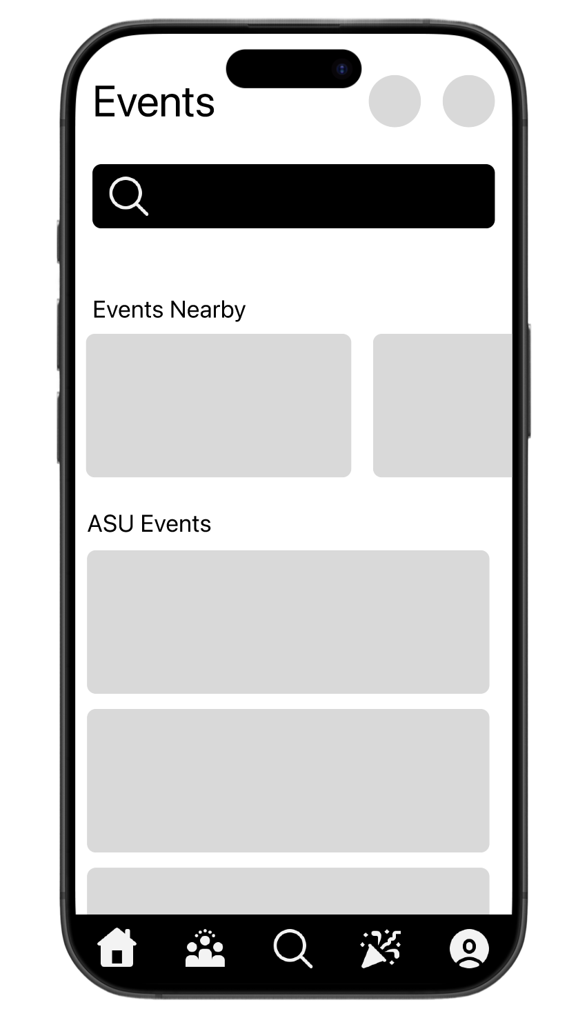
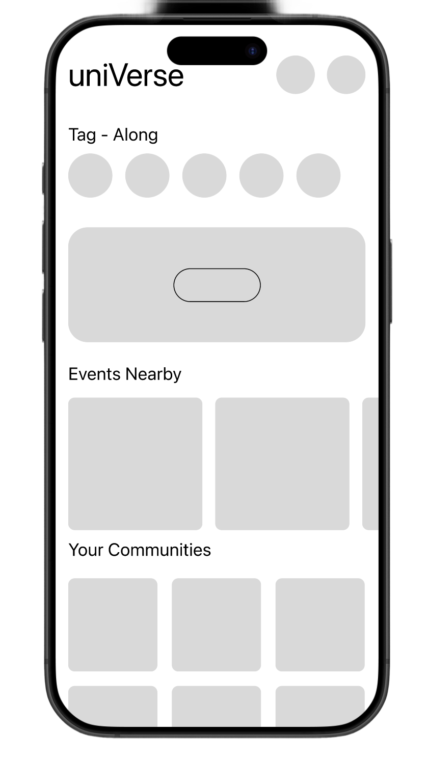
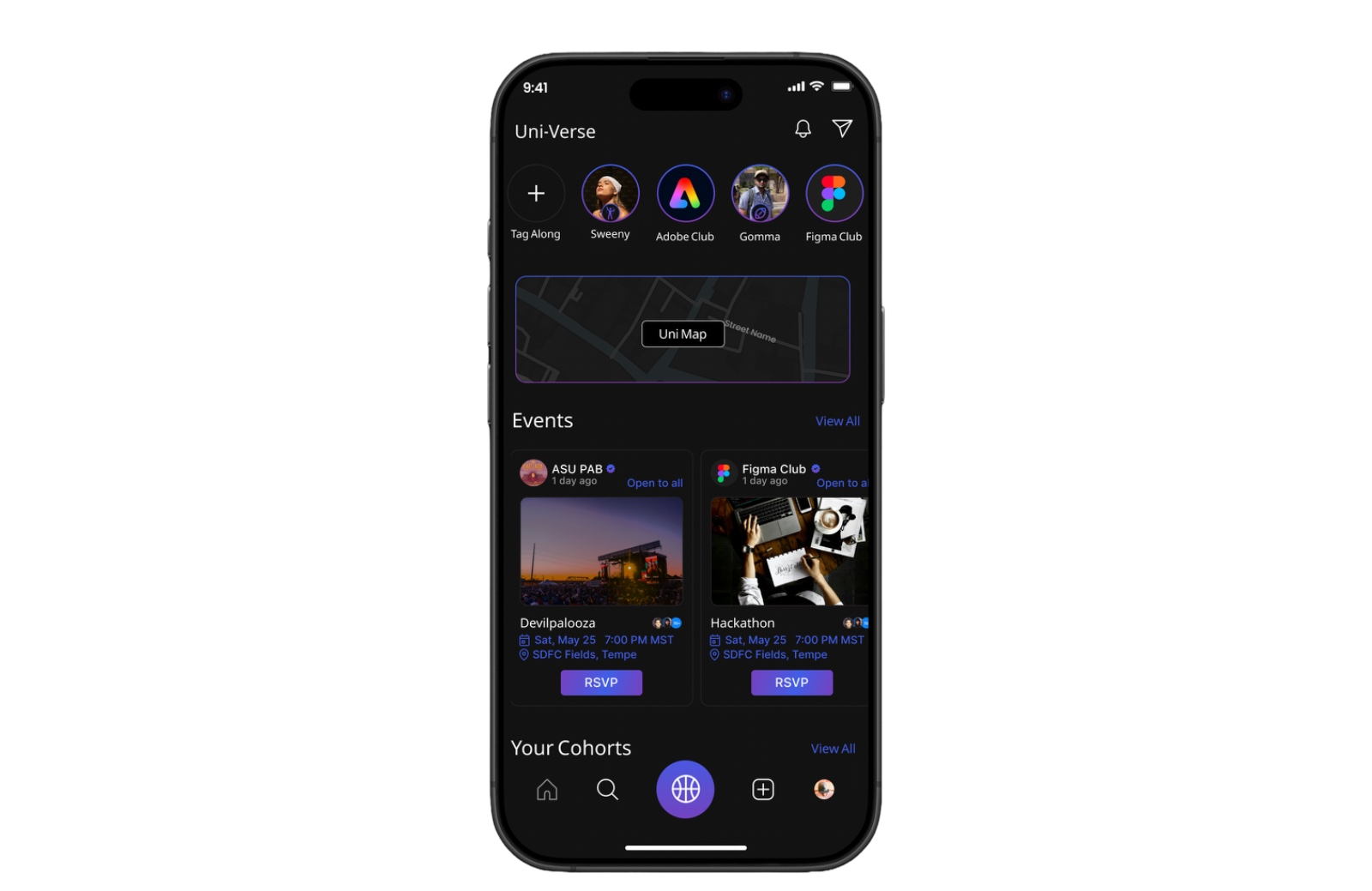
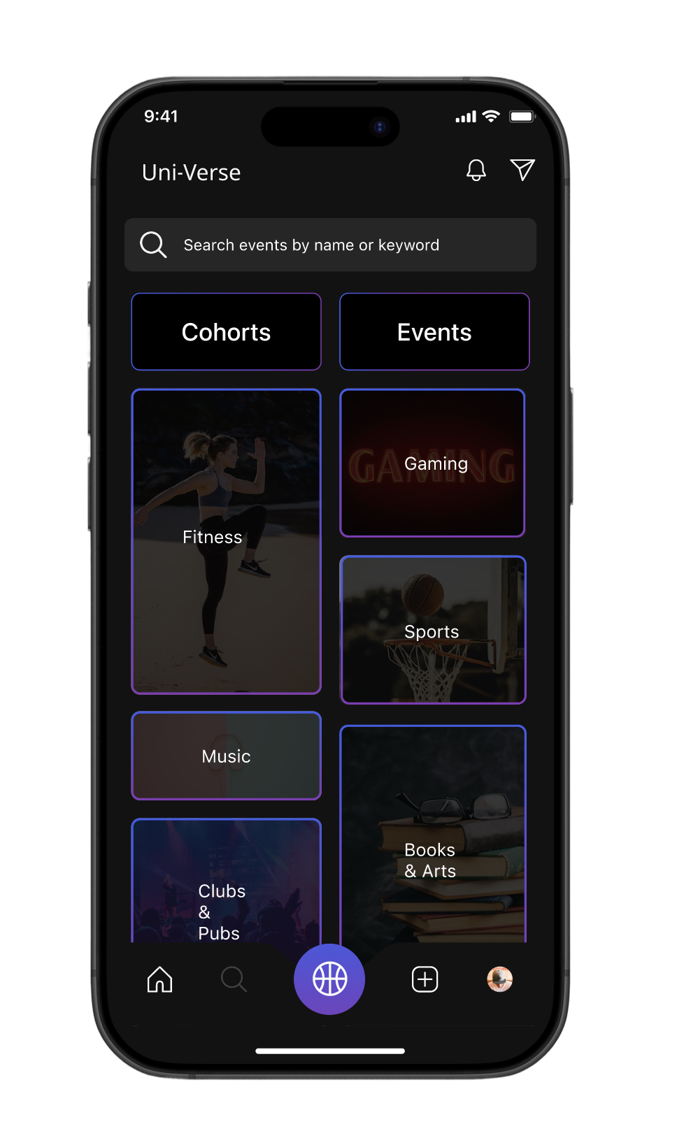
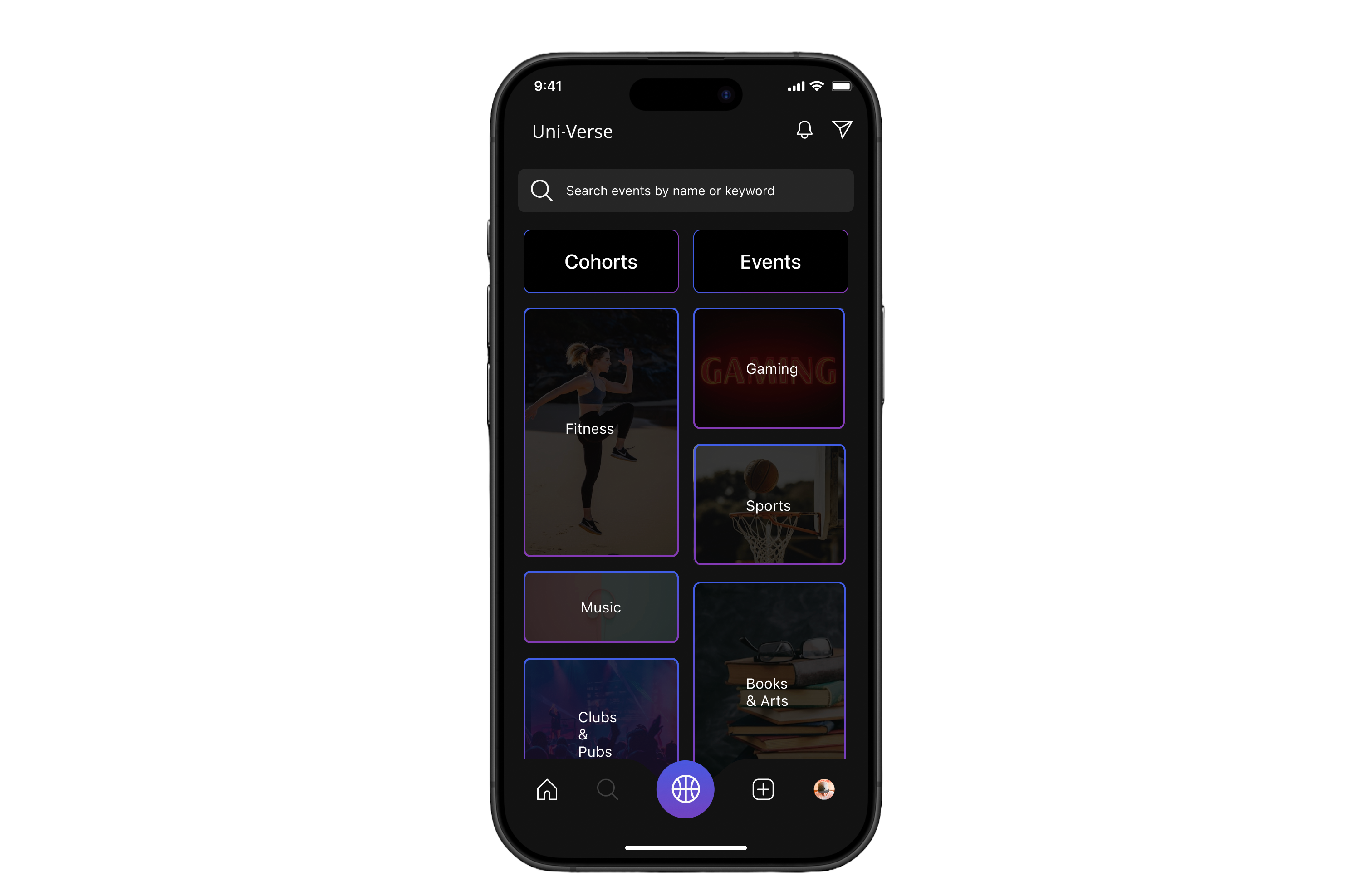
Home


Quick access bar – Tag-Along and Clubs pinned at the top for instant navigation.
Interactive Heat map helps students to track shuttles and explore live events
Cohorts preview – Quick access to joined communities/ Groups
Bottom nav bar – Simple navigation across Home, Explore, Tag-Along, and Profile.
Events section – Shows upcoming activities with RSVP option with an option to navigate and view all events
Event details – Clear info: host, time, date, and location.
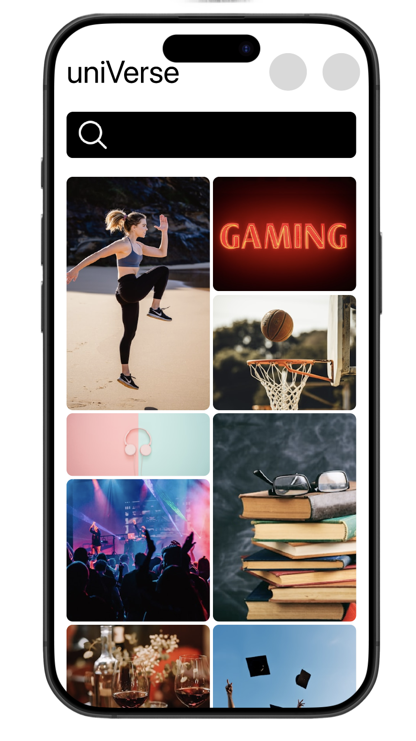
Search
Search bar – Quick lookup for events or cohorts by name/keyword.
Visual cues – Image-based tiles make browsing intuitive and engaging.
option to navigate to cohorts and events page
Category cards – Clear options like Fitness, Gaming, Sports, Music, Books & Arts.
Social Heat Map
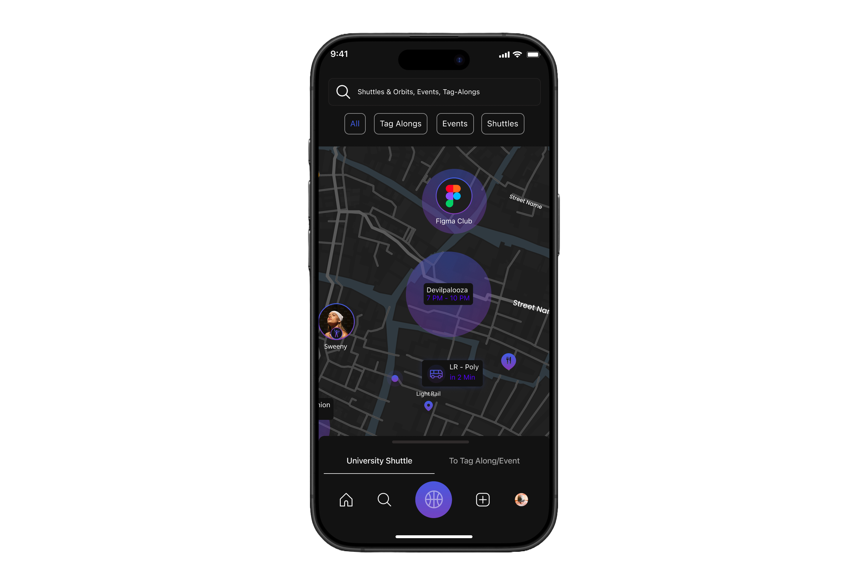
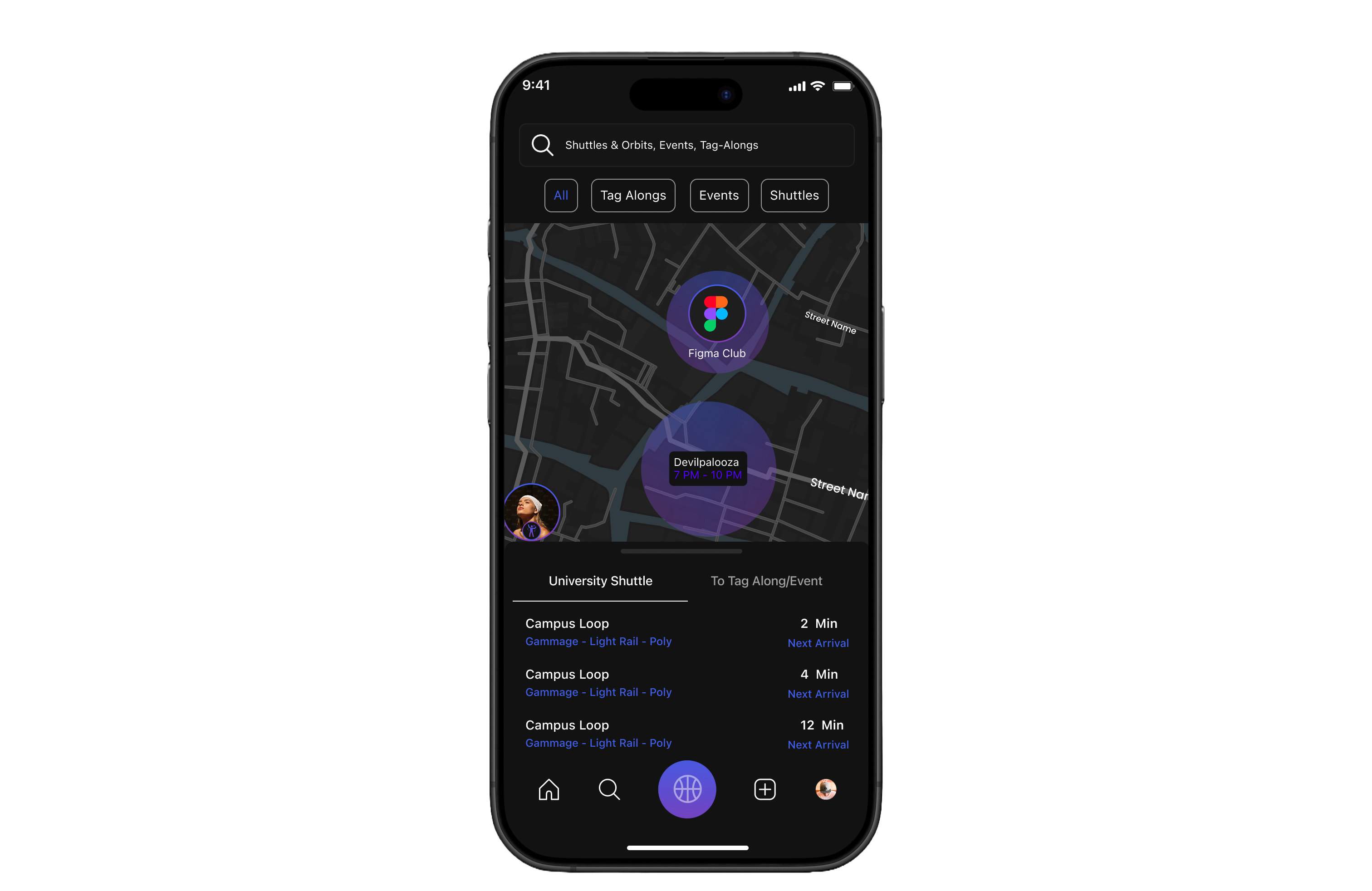

Search bar – Quickly find events, Tag-Alongs, or shuttle info.
Filter buttons – Toggle between All, Tag-Alongs, Events, and Shuttles.
Live map view – Real-time visualization of events, clubs, and student activity.
Shuttle tracking – Live updates on shuttle location and next arrival.
User presence – Shows peers attending nearby events, reducing hesitation to join.


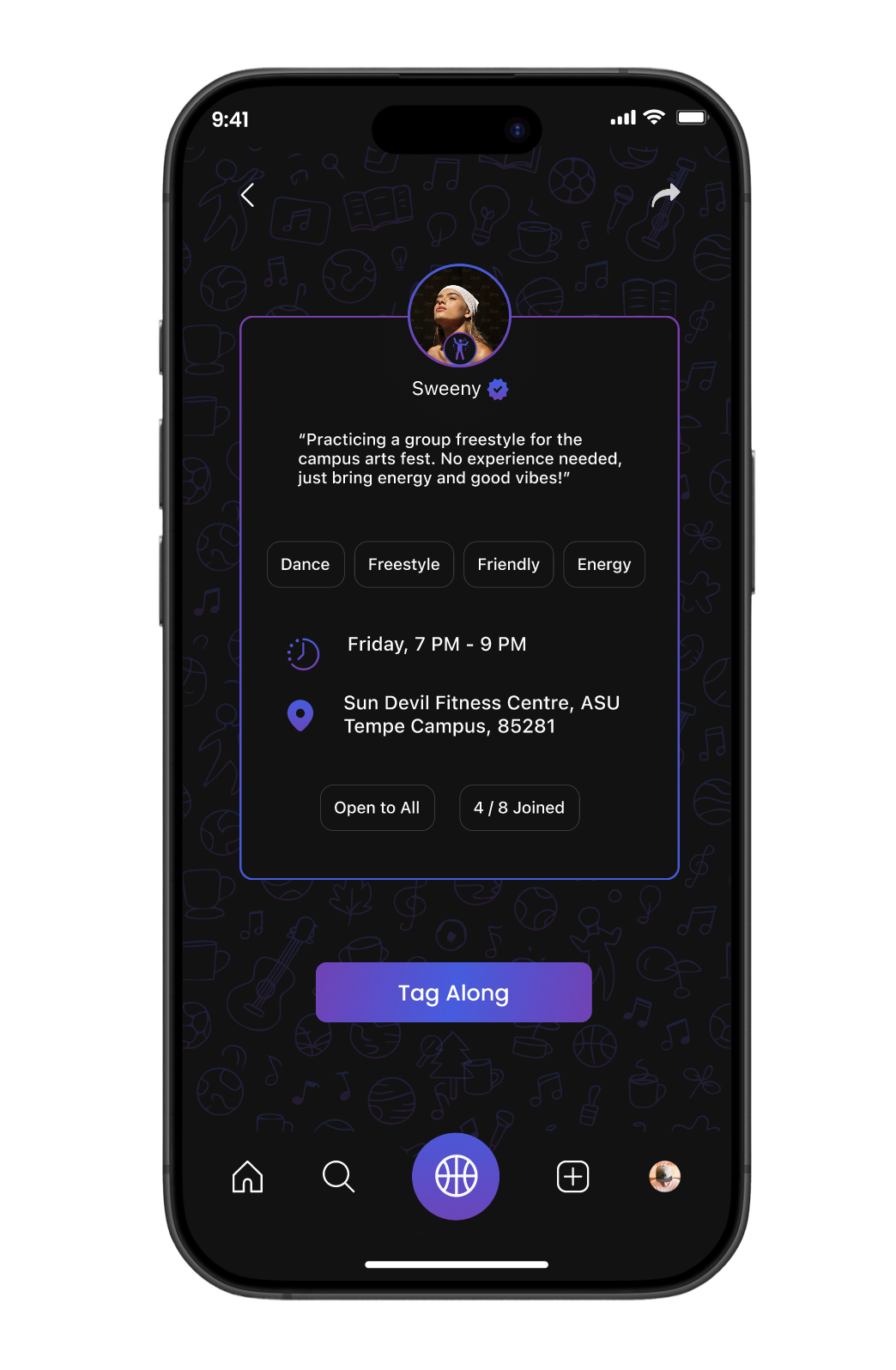
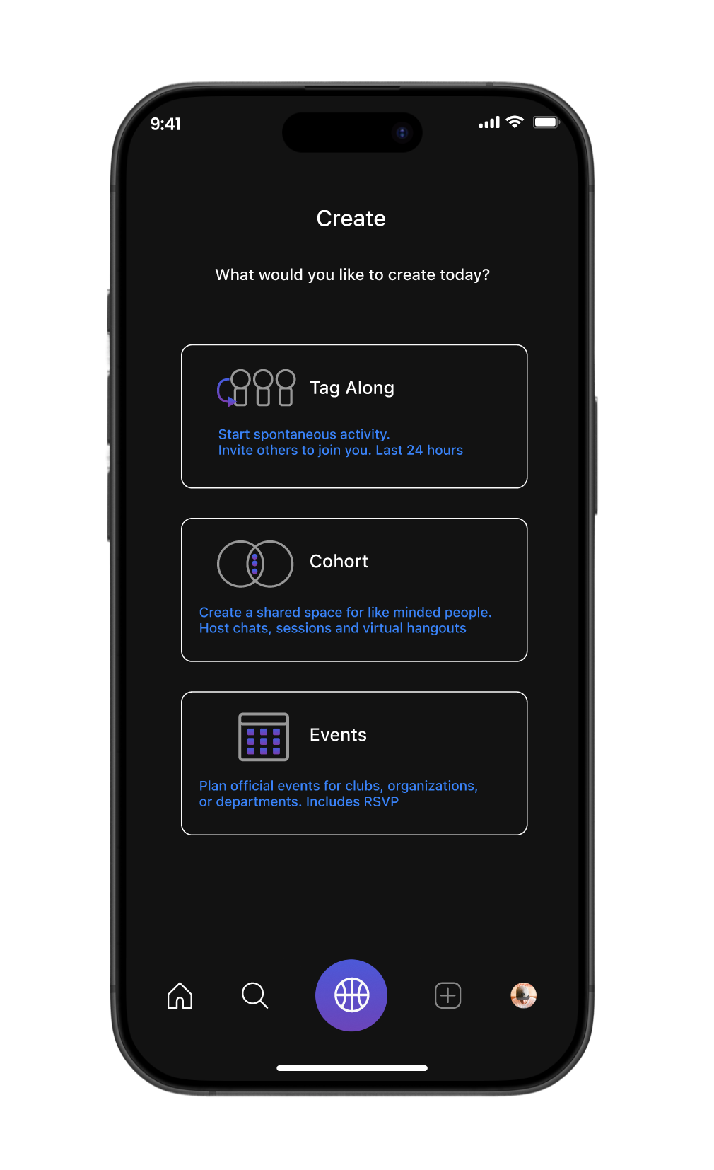
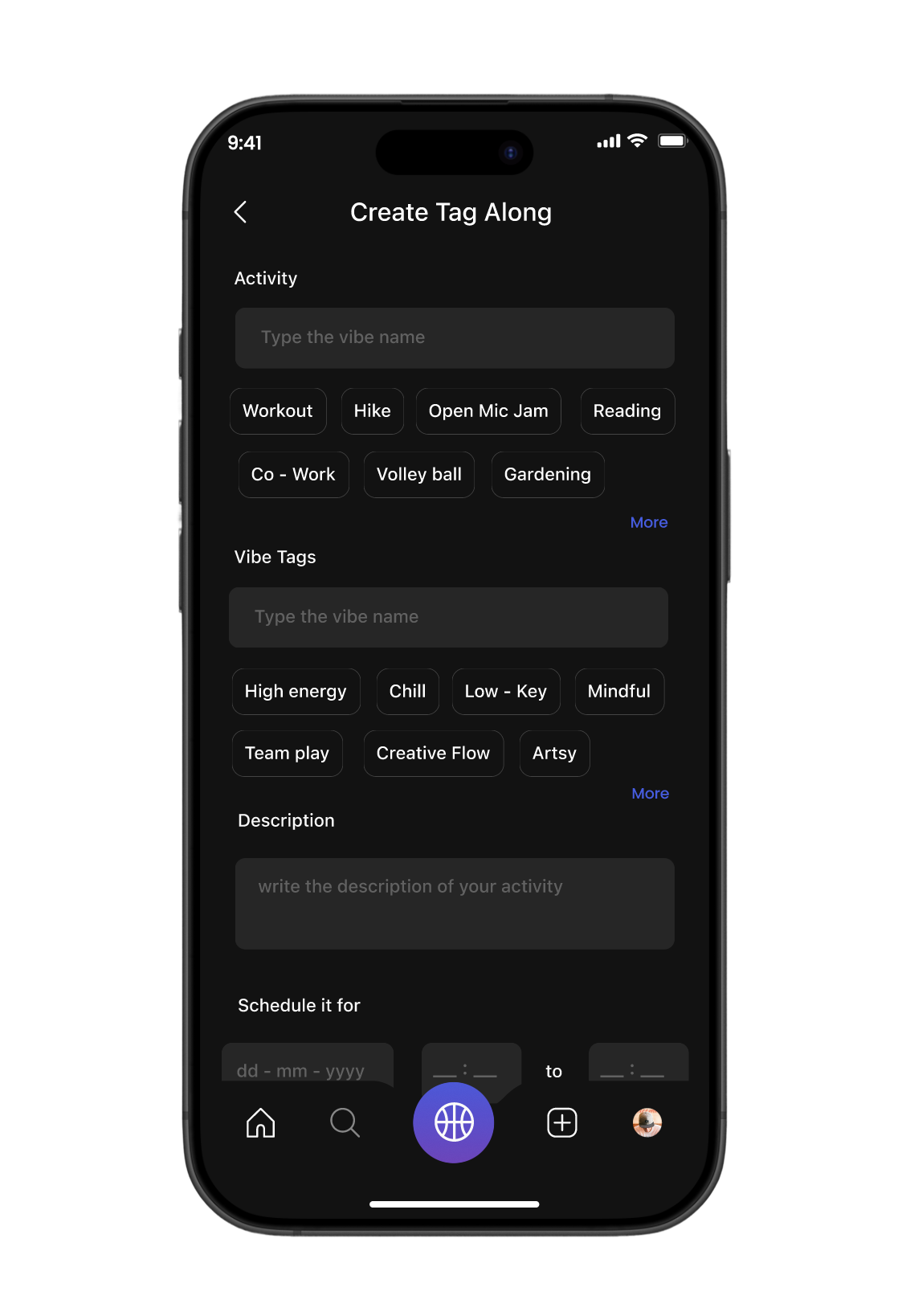
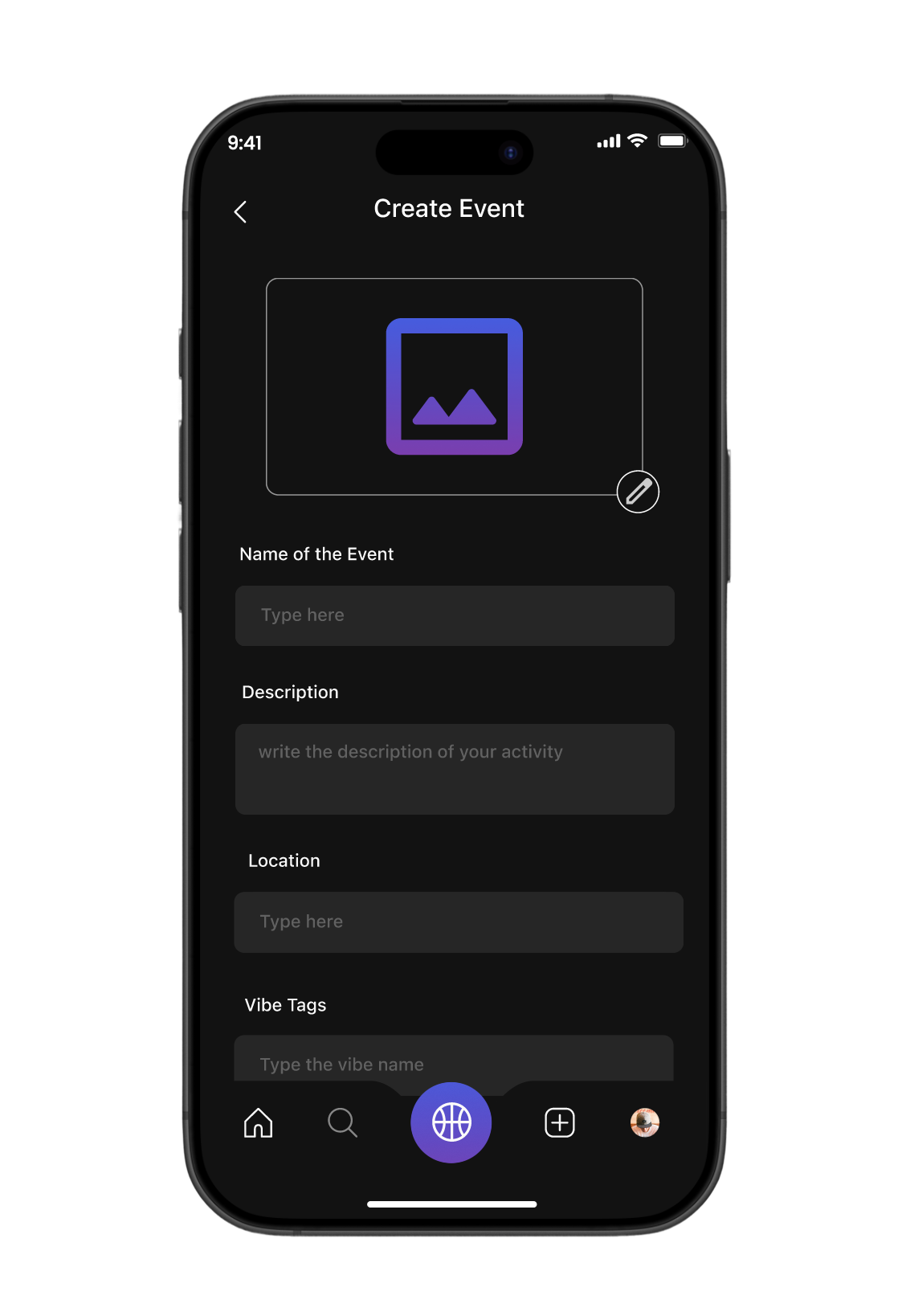
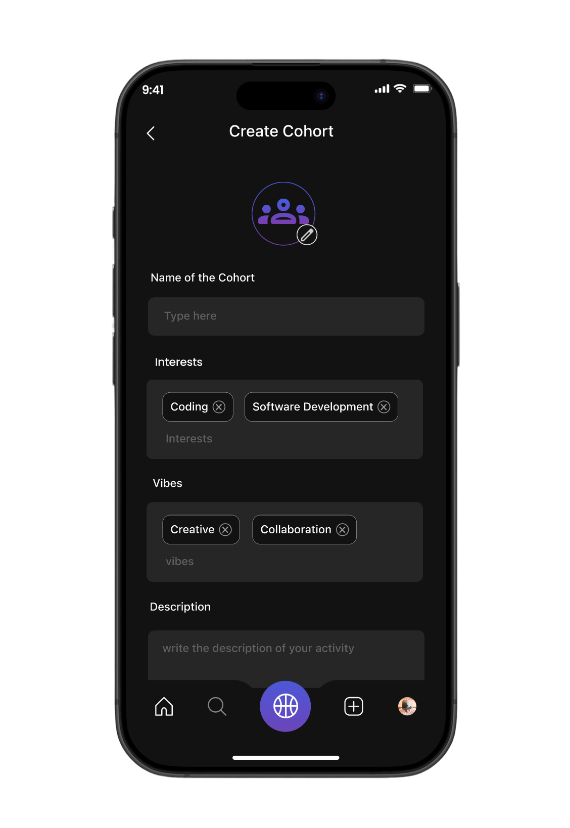
Create
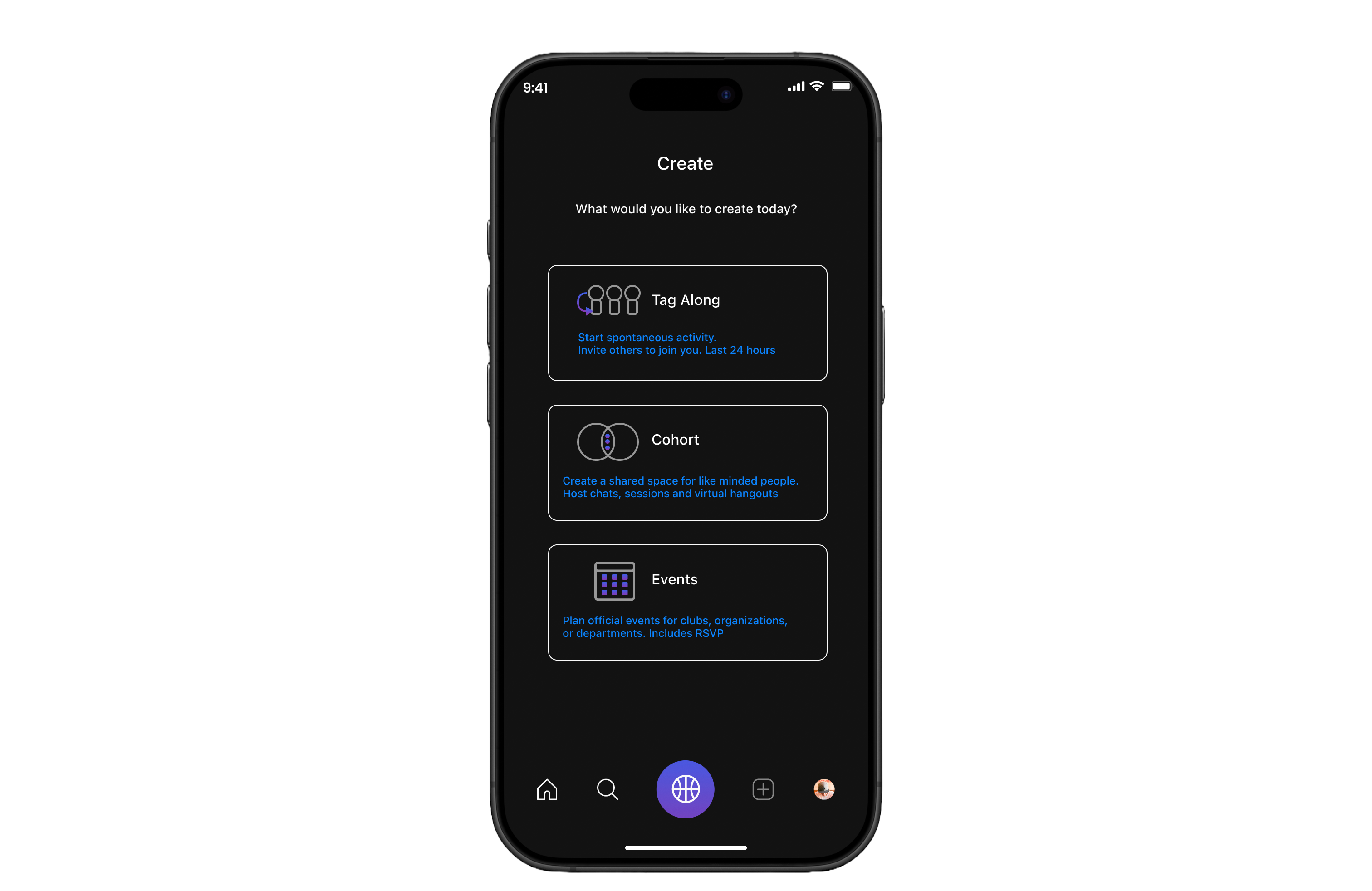
Clear entry point – Users choose what to create: Tag-Along, Cohort, or Event.
Minimal layout – Simple design keeps focus on action, reducing friction.
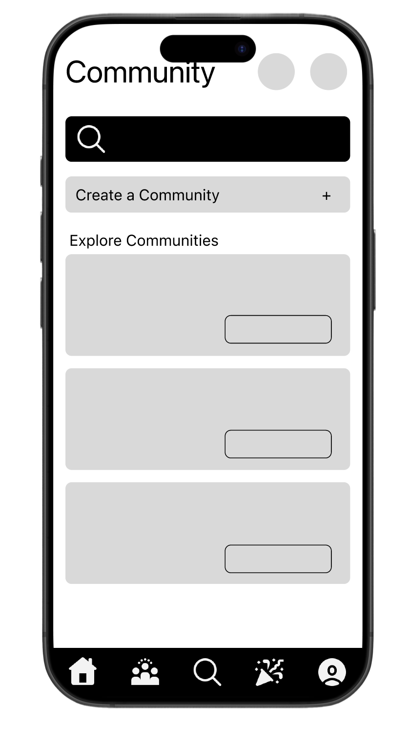
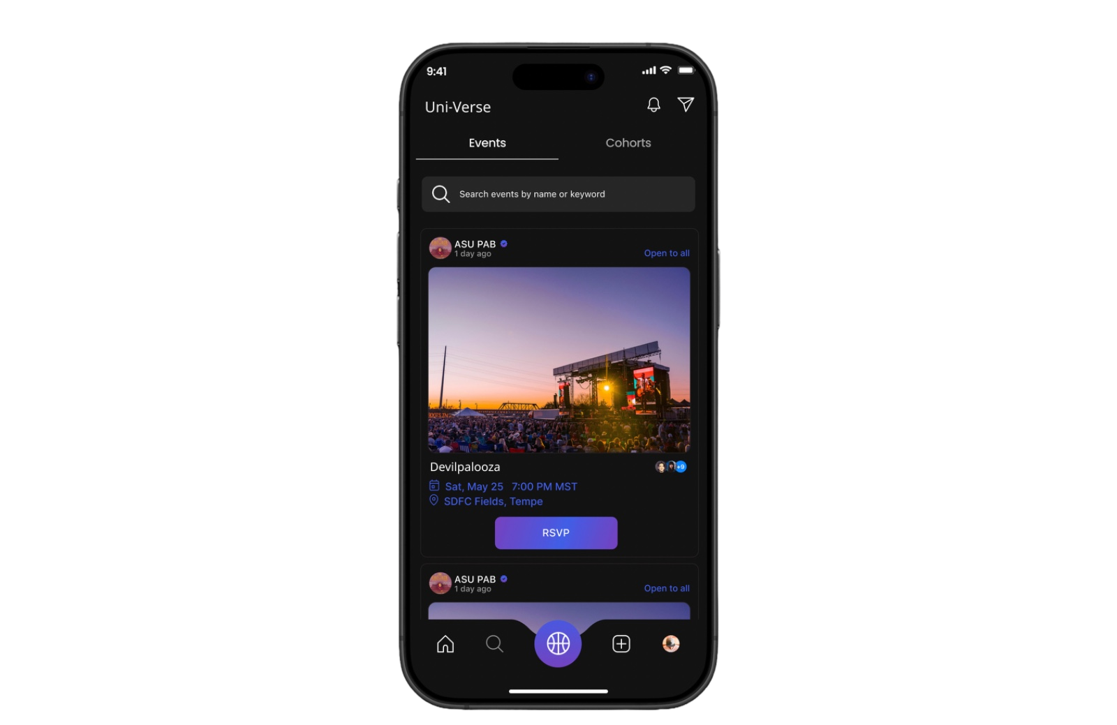
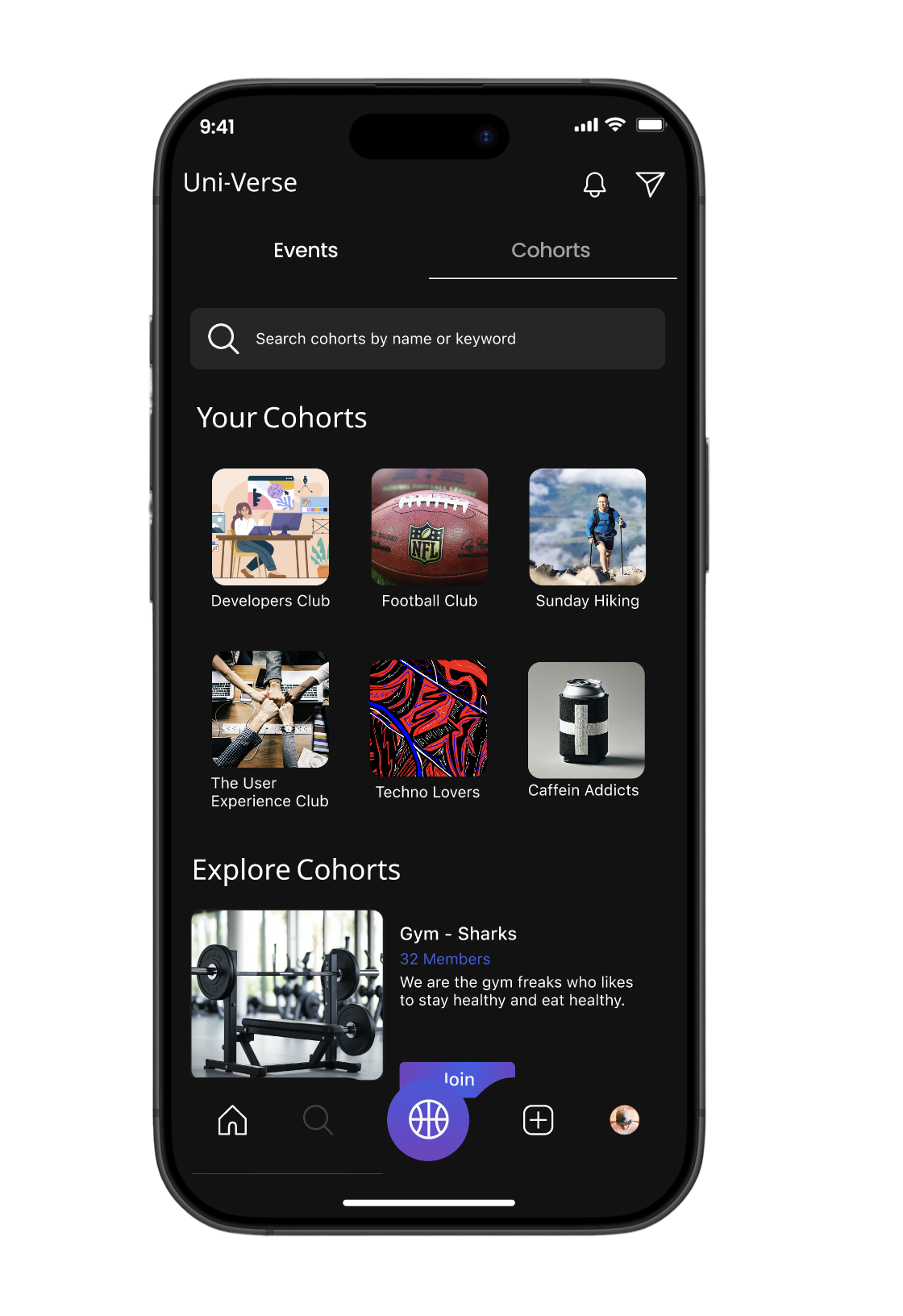
Events and Communities

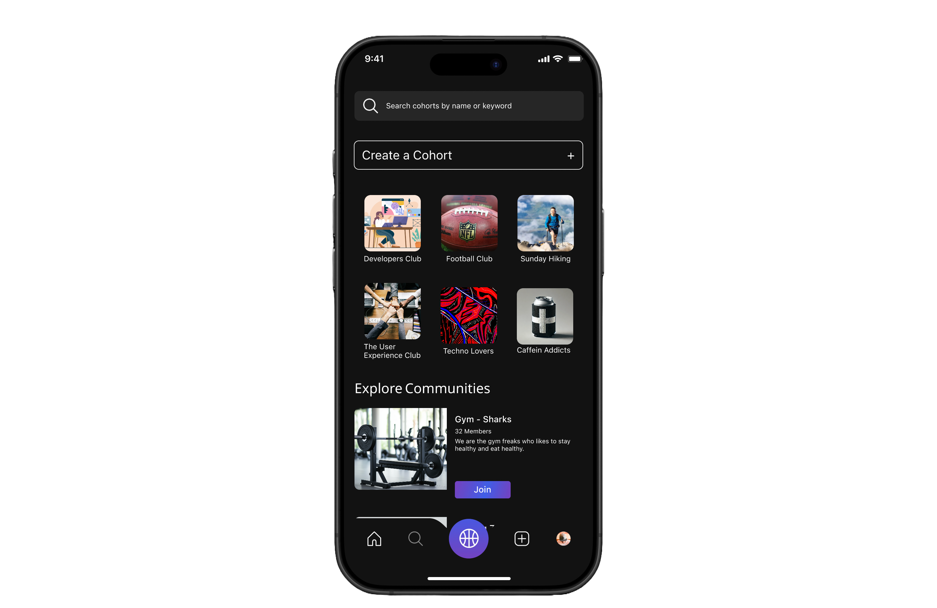


Tabs – Toggle between Events and Cohorts for easy discovery.
Event card – Displays image, host, title, time, date, and location.
RSVP button – Simple call-to-action to confirm attendance.
Community visibility – Shows number of attendees to encourage participation.


Create a Cohort – Easy entry point to start a new group
Community grid – Visual cards (e.g., Hiking, Football, UX Club) for quick discovery.
Explore section – Highlights active communities students can join instantly.
Join button – Clear CTA for effortless onboarding into a group.
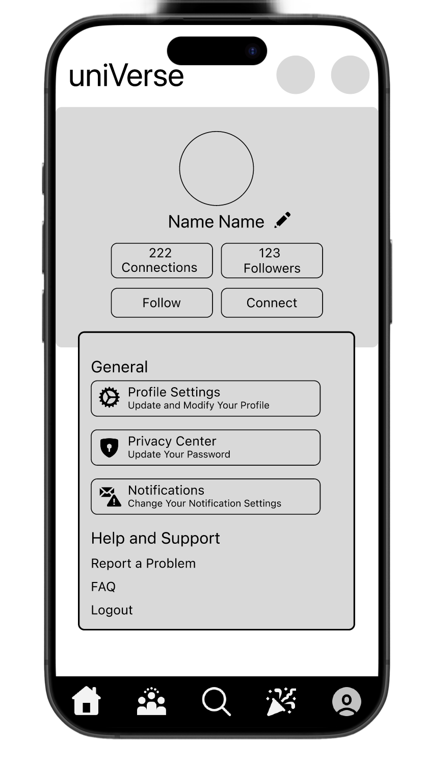
Profile Page
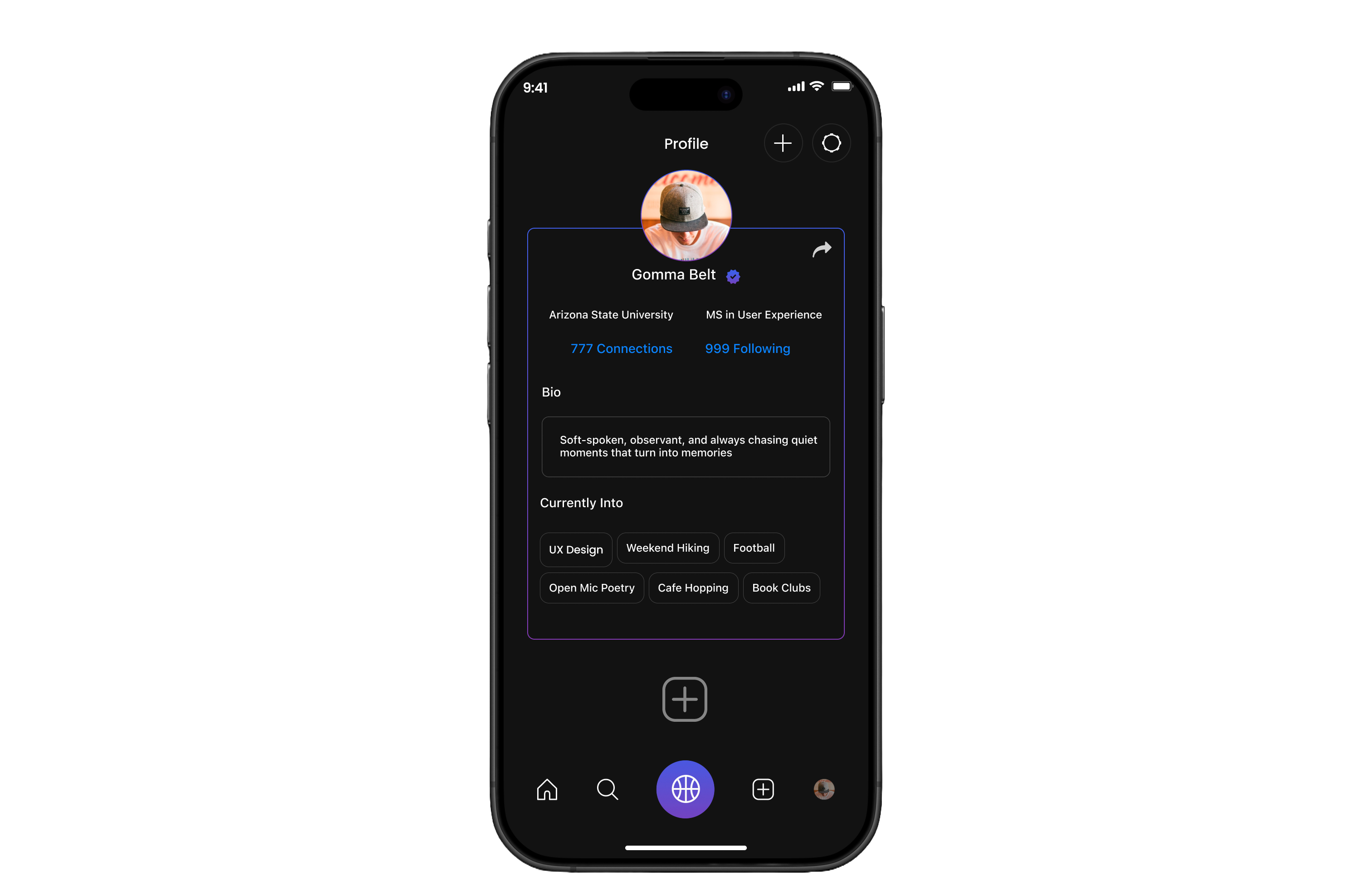


User identity – Name, photo, and verification badge build trust.
Quick actions – Buttons to edit profile, add interests, or share.
Connections & following – Shows network size, reinforcing social engagement.
Option to navigate to create page

University details – Displays school and program for context.
Bio section – Personal description to express individuality.
Interests tags – Highlights hobbies and passions for easy discovery by peers.
Data Input
Other Screen
Testing
Although large-scale usability testing is planned for the next iteration, we have already begun piloting Uni-Verse with students across campus through small group walkthroughs and prototype trials. The goal was to see how well our design supported real student needs and how natural the interactions fel
Personal Reflection
Working on Uni-Verse was deeply personal for us. We believe that true innovation comes when you’ve actually gone through the pain and experienced it yourself and we had. Missing classes because of unreliable shuttle timings and feeling hesitant to attend events alone were challenges we lived through, which gave us the empathy to design meaningful solutions.
Throughout the project, we made it a point to seek feedback from peers after every milestone, which sharpened our collaboration skills and helped us see problems from different perspectives. We also held ourselves accountable by setting collective deadlines and meeting them, which strengthened our time management. In the end, Uni-Verse didn’t just solve problems for students it helped us grow as designers who lead with empathy, embrace iteration, and believe in solving from lived experience.
Behind the Scenes

Awarded as the best UX/UI Designer for Universe by ASU GIT
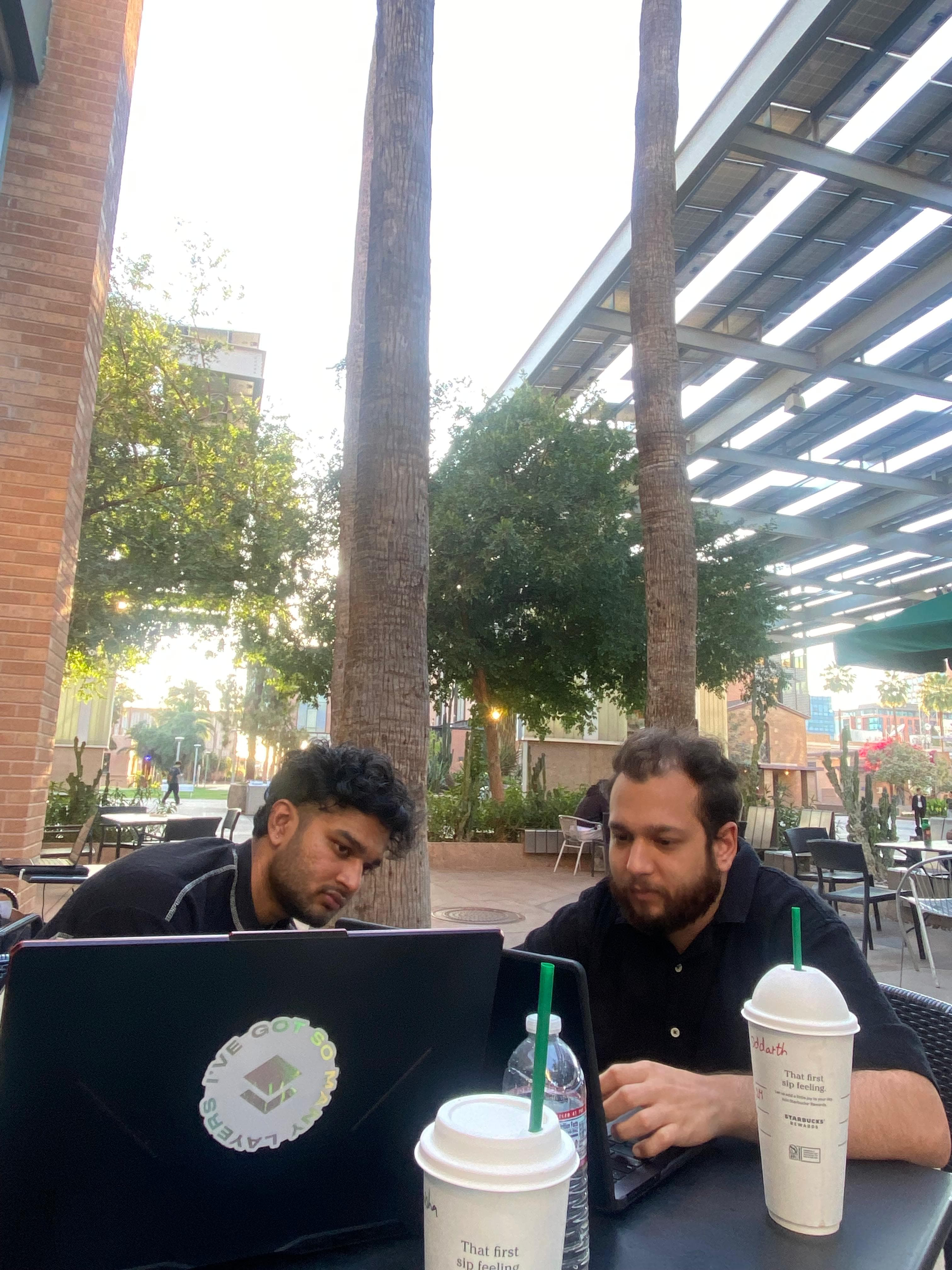
Team at Work
AB Testing (Naming the App)
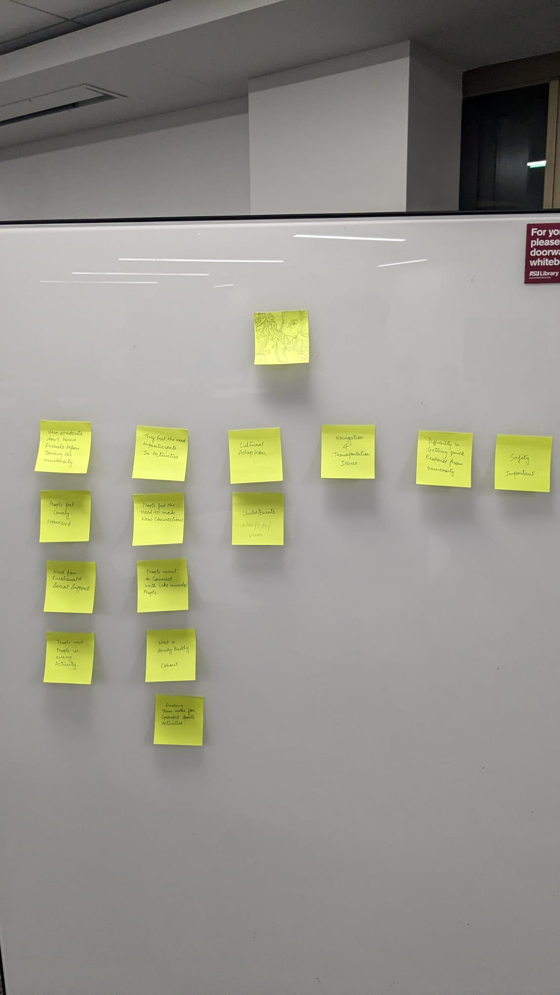
Sticky Note Wall
Survey & Interview